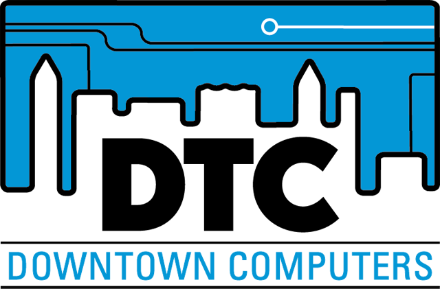
Downtown Computers logo redesign
The existing logo used a stylized desktop computer that dated the look of the company. The logo redesign is a rebranding strategy to position the company closer to its business target market and move away from recognizable technology that is likely to be quickly out of date. The stylized circuit board references technology without marrying it to a specific device and incorporates a cityscape of downtown Orillia. The blue background references Orillia's lakes. The acronym DTC has been used internally at Downtown Computers to denote it in-house brand of custom-built computers and this logo emphasizes the acronym while still tying in to the company name.


